
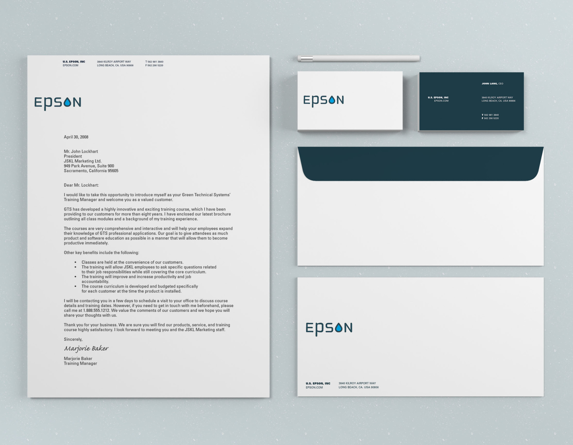
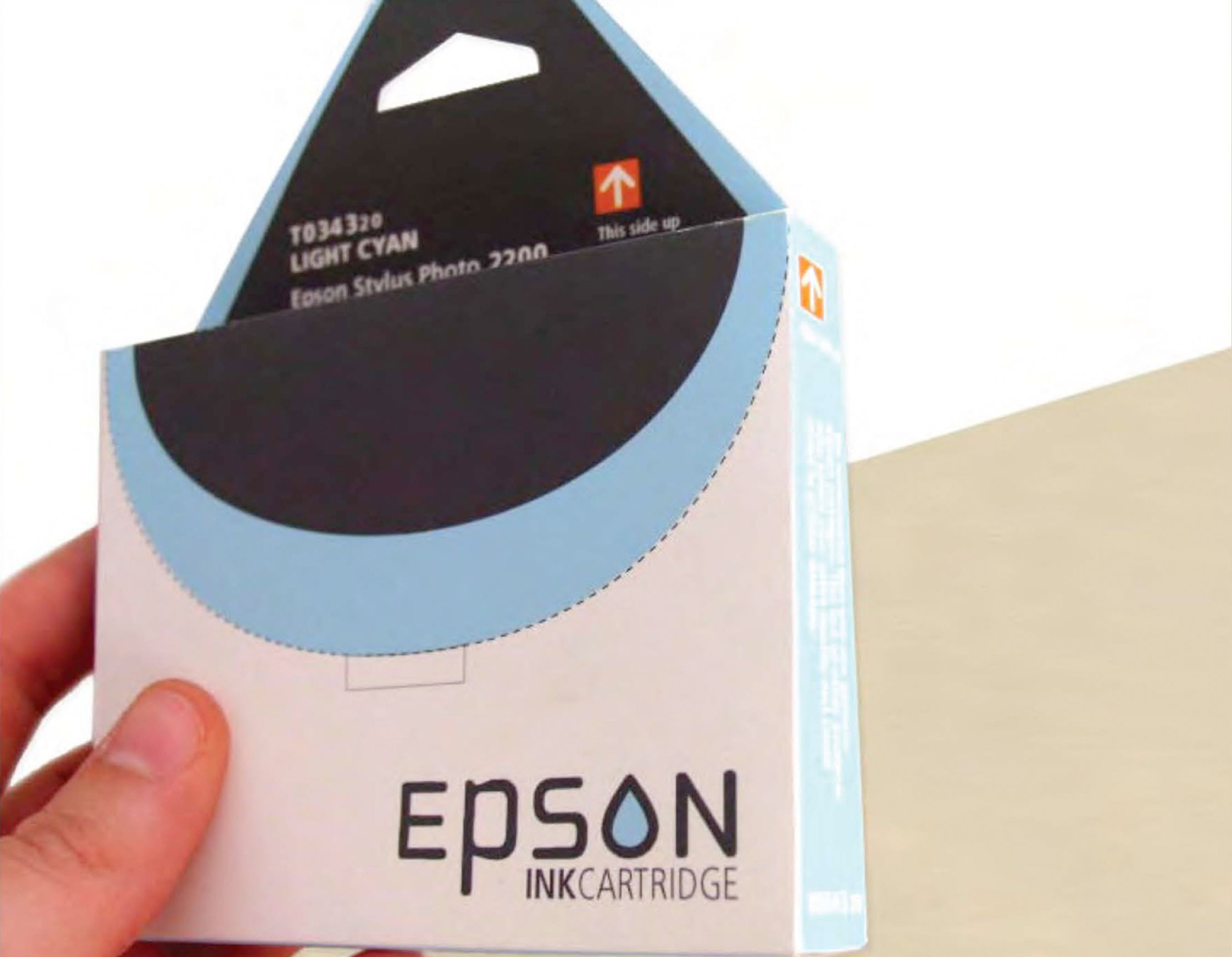
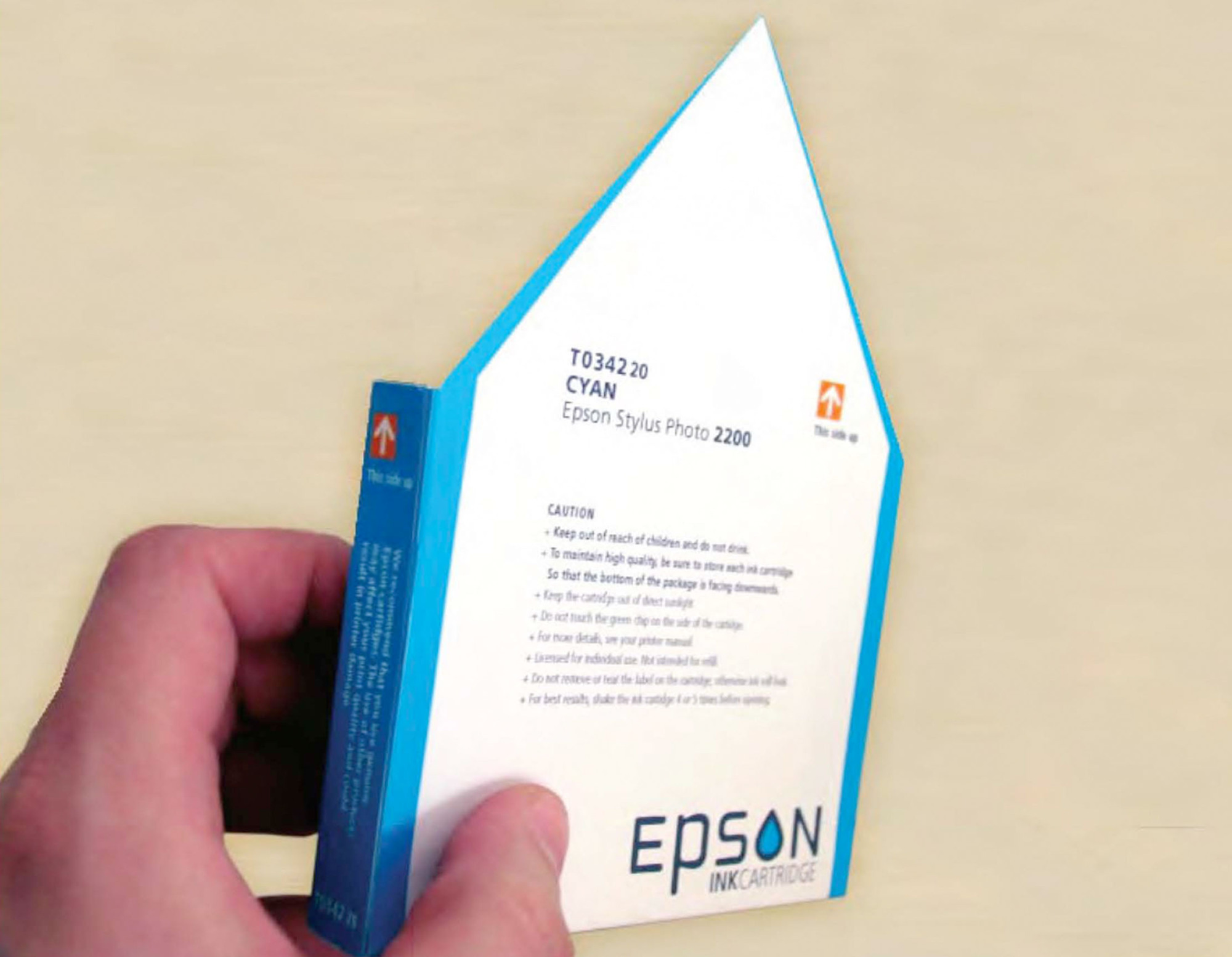
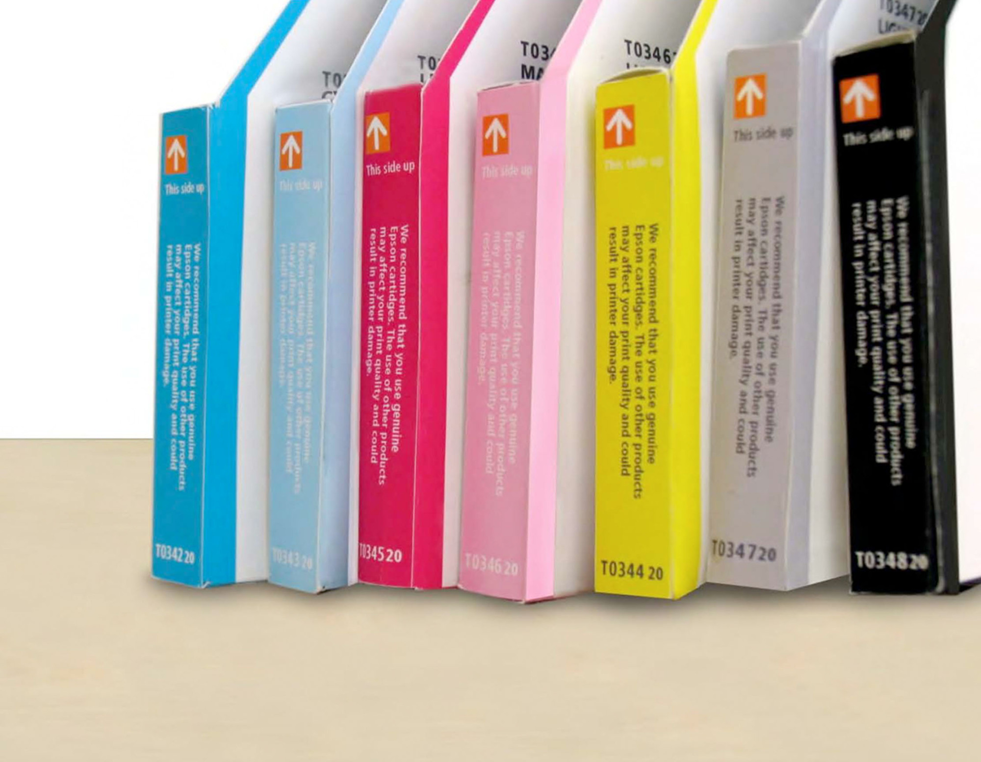
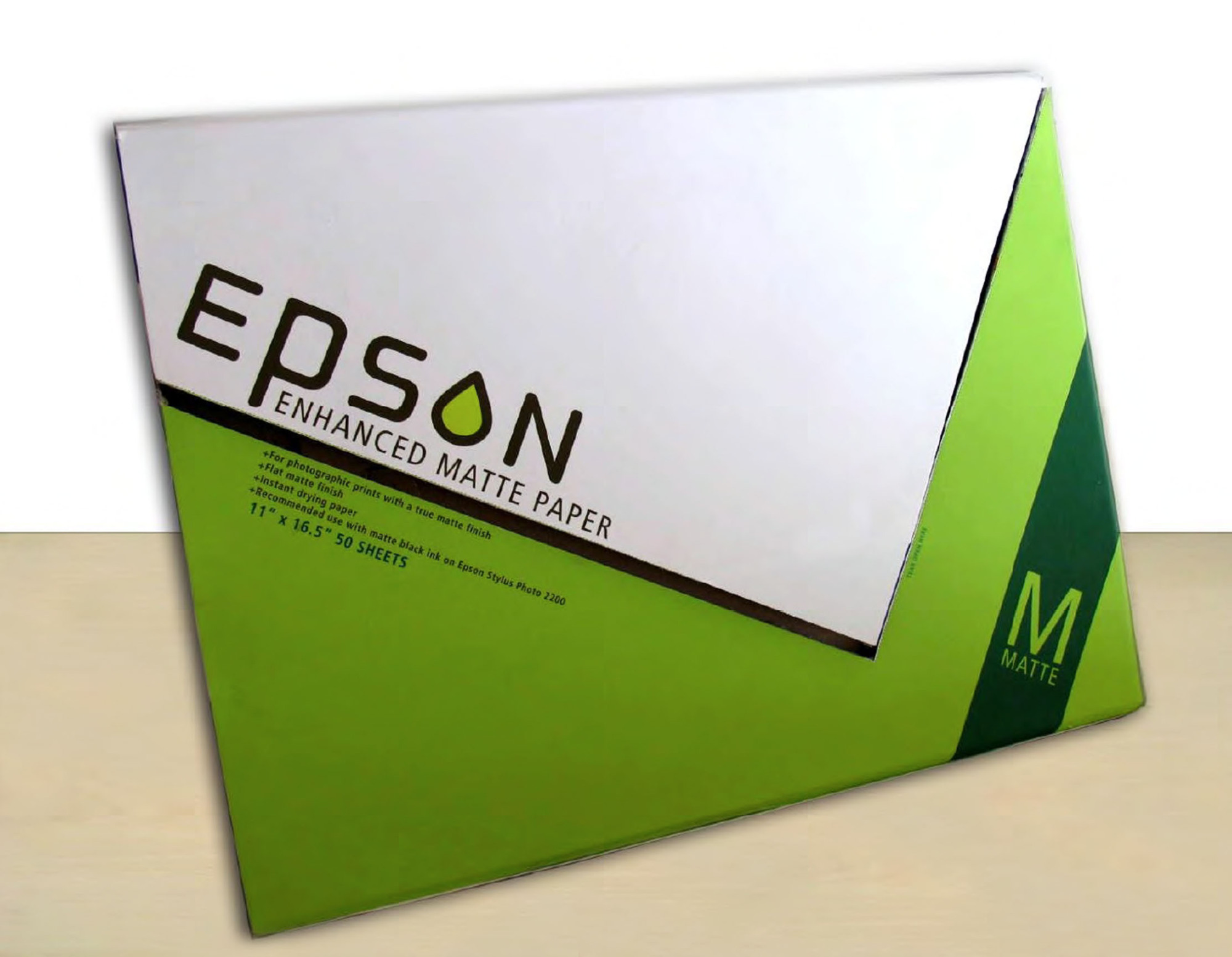
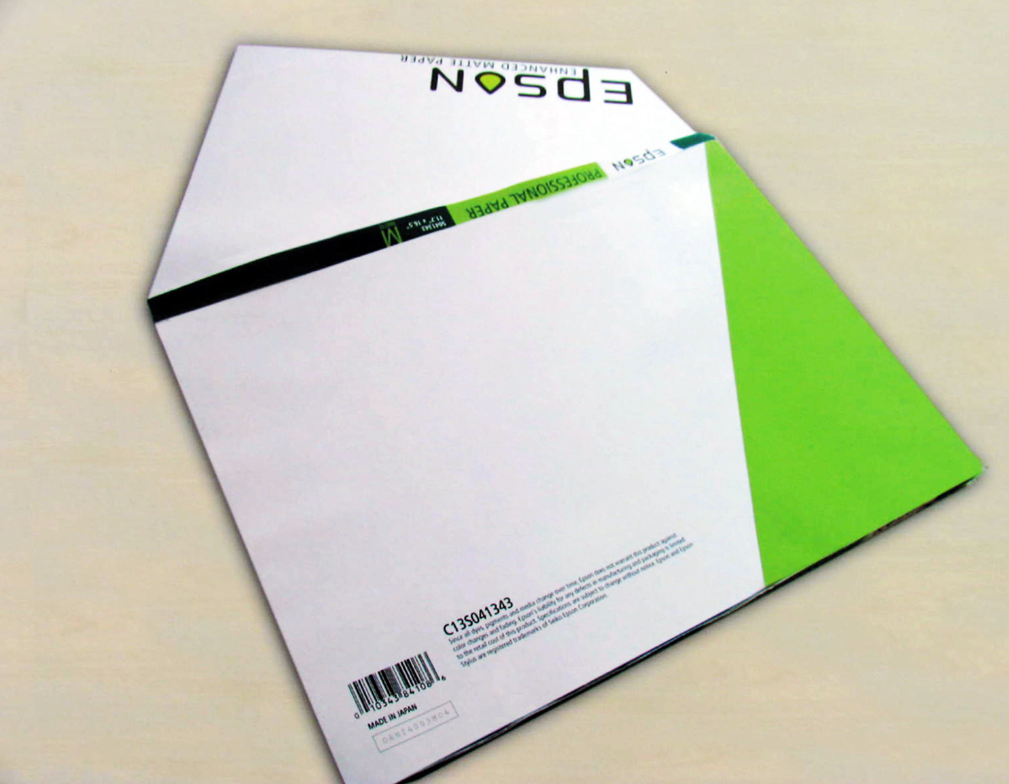
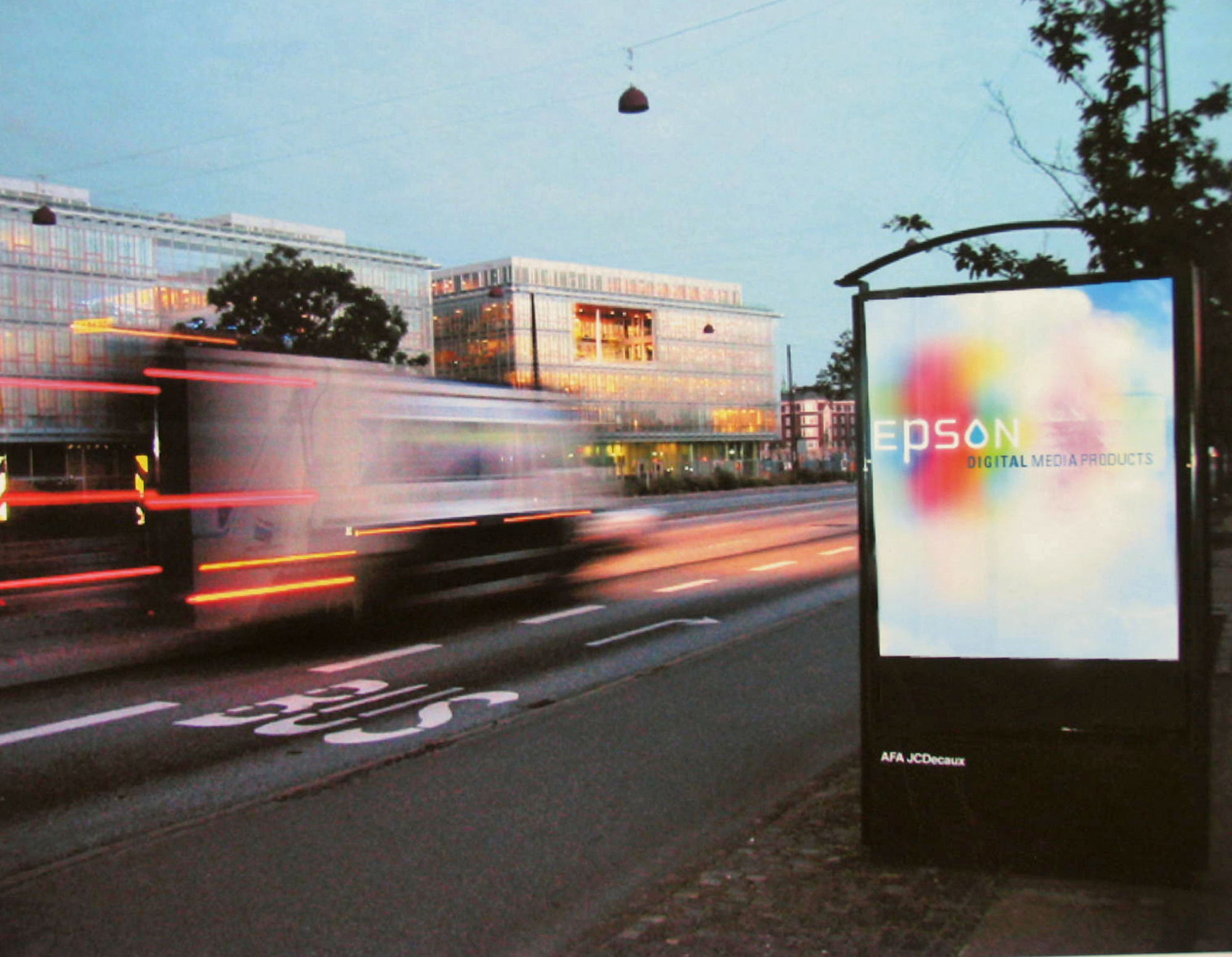
This project involved a case study focused on rebranding and packaging for Epson. The original ink packaging was excessively large, prompting a reduction in size to enhance sustainability. Additionally, I aimed to improve color visibility for consumers, whether shopping in physical stores or online. The new design effectively represents Epson's core offerings: printing, inks, and paper. Furthermore, the branding was tailored to appeal to Epson's target audience, which includes designers and photographers. This initiative was highlighted in the publication "Really Good Packaging Explained: Top Design Professionals Critique 300 Package Designs and Explain What Makes Them Work."


